The worst experience is looking for a job for long months, interviewing, signing a contract and shortly after being deeply disappointed with your new workplace. But we’re here to let you in on a little industry secret that will spare you this disappointment: We’ll teach you how to read between the lines of a tech company About Us page.
So when looking for a job, or weighing offers, these 5 tried-and-tested tips will help you decode any company’s About Us page and reveal what the company is really like and whether you want to work there.
1. Are they super into themselves, or modest and down to earth?
A cardinal rule of About pages is to strike a balance between demonstrating how the company helps, and bragging.
Do they use superlatives like “the best,” “disrupting the x industry” or “the first company ever to do…” or do they display actual numbers and testimonials to demonstrate their success?
Do they talk about their audience’s needs, or about their amazing solution? If they sound self-absorbed, that attitude may translate to the office.
“Yes, it’s a spot for you to talk about yourself — but only in the context of how you serve your readers.” – Copyblogger
2. What do they call the About page?
You can tell quite a bit by what a company calls its About page. Did they choose a clear straightforward name that you can understand? If they did, this means they are good communicators and down to earth people.
However, if they used cryptic or pretentious names like “Our Ethos,” “The Journey,” “Experience”, it’s very likely that they are more focused on making an impression than on being understood. Poor communication skills are not a good sign.
“I don’t want to look at your “Resonate” page and wonder if that’s where I find out who you are, what you do, and why I should read your site.” – Copyblogger
3. Do they have photos of real humans?
You can get a sense of the company character and culture by the photos they post. Are there photos of the company fun day at the beach? Or a drunken work night out? Or a charitable fundraising event? Are the expressions on their faces solemn or goofy?
If they post drawings, cartoons, or avatars instead of actual photos, you have to wonder why — is this an “alternative” group, or are they trying to hide something?
Eight Hour Day uses photos effectively to humanize their page:
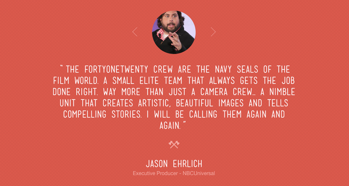
4. Do they include testimonials?
Testimonials are a good sign: they lend credibility, and show that the company cares about what users are saying.
It’s a sign that the company is on its way up and has happy customers to show for it. That’s in contrast to a company that boasts success, but strangely enough can’t show even one testimonial.
FortyOneTwenty relies heavily on testimonials to tell their story:
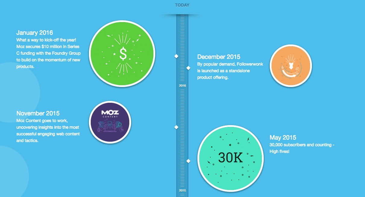
5. Do they have a timeline?
Companies with well-done timelines get bonus points for two reasons: timelines are aesthetically appealing, and they demonstrate the company’s evolution.
Timelines can give you a sense of how long the company has been around, how quickly they have grown, how flexible and innovative they are in terms of product development, and more.
Whether you’re looking for a young startup or a behemoth that’s been around since before you were born, you can look at the timeline to tell who is right for you.
Moz uses a timeline beautifully to tell their story in a compelling way:
Of course, you can’t judge a company entirely based on their About Us page. Some companies haven’t invested in, updated, or even created an About page simply out of absent-mindedness. (But that also says something about them.) So if you’re trying to get a sense of a potential new employer, take a close look at this page. Read between the lines. Do you feel a connection? Could you see your picture up there, too? Or does it feel foreign and unappealing? We hope these tips help you, and would love to hear your feedback!


